We turned our logo into a typeface, and it still matches the logo to 98.6%
Book a call, get a price rangeAlterra Primary is our own type family, grown from the Alterra wordmark. The five logo letters are traced from the file, the rest follow rules measured from them, and a text companion, Alterra Secondary, carries everything under the headline. It's our brand, not client work.
A five-letter wordmark with no vector source had to become a typeface that still sets ALTERRA exactly.
We measured the logo, traced its letters and generated a display family and a text companion in code.
Six weights across two familiesDrawn on October 4, 2026
- Client
- Alterra Studio, our own brand
- Stage
- Venture / in-house
- Services
- Typeface, type film
- Timeline
- Drawn October 4, 2026; film finished October 5, 2026
- Tools
- Python (fontTools), Rive
- Website
- Read how we built it
The problem and the brief
Five letters in a logo file had to become a type family that still sets ALTERRA exactly.
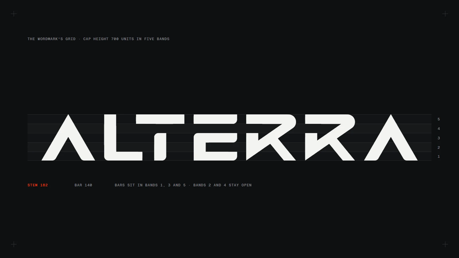
The wordmark existed only as a 2,000-pixel image. Nobody had written its rules down, and it had only five distinct letters.
We wanted the brand to be able to set any word in its own letters, from a lockup to a big number, plus a text face for copy and interface that belongs to the same family.
The research
Three questions a typeface drawn from a logo has to answer
- Brand
Does ALTERRA still look exactly like the logo?
- Designer
Can it set any other word?
- Reader
Will it read at 18 pixels?
The approach: measure the logo, then let its rules draw the rest
We measured the logo, wrote its rules down and had code apply them to every letter, so the family can't drift from the mark.
- Question 1 · The logo
Does ALTERRA still look exactly like the logo?
The logo letters are traced, not redrawn
A, L, T, E and R are traced from the original file at four times its size and scaled onto a 700-unit cap height. When the font sets ALTERRA, the word lands on the logo.
Laid over the logo, the traced letters cover 98.6% of the same pixels. The difference sits in the anti-aliased edges.
- Question 2 · Any word
Can it set any other word?
Four measured rules draw the other letters
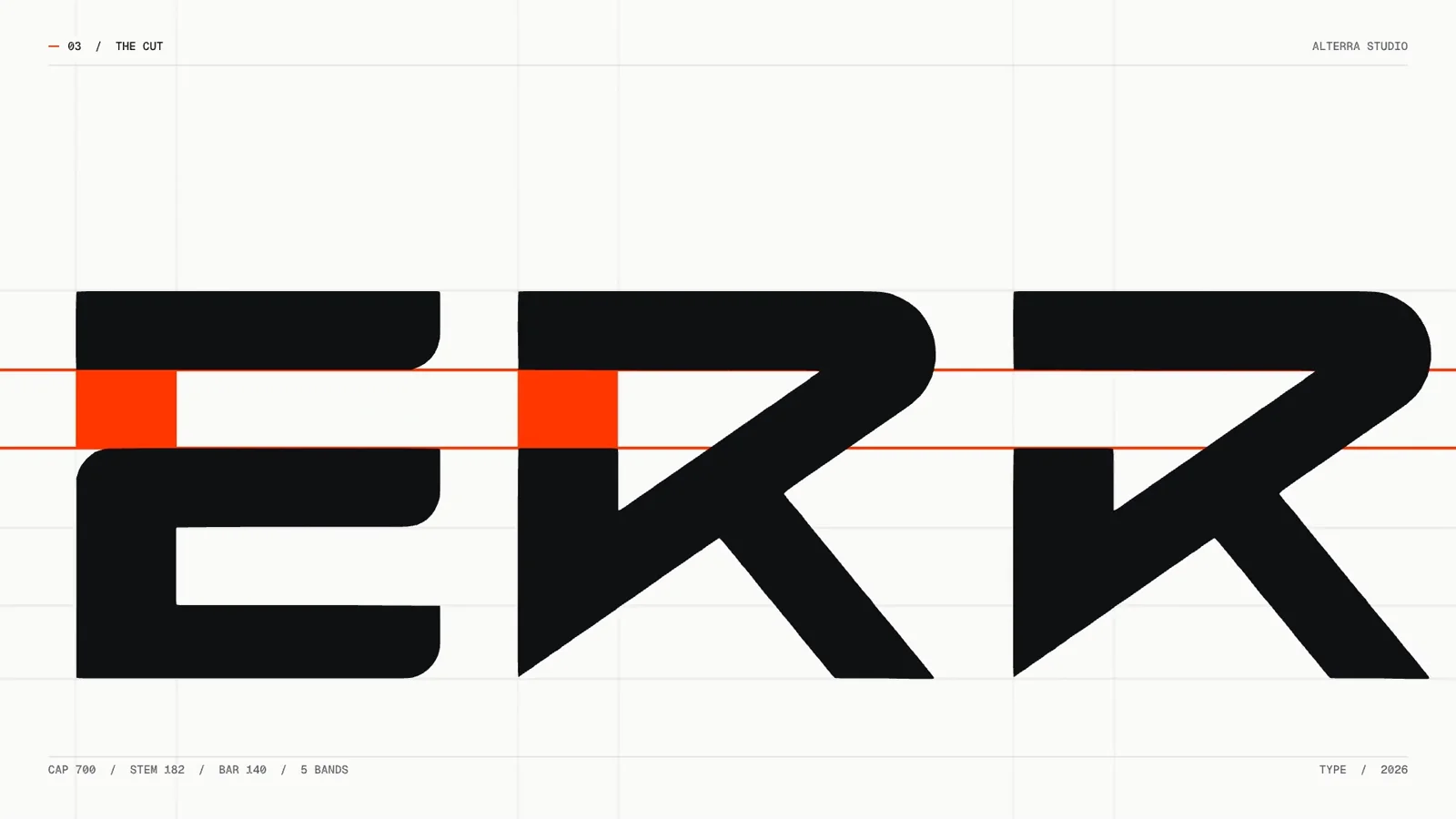
Bars sit in the logo's five bands. A stem that meets a top bar stops one band short, so B, C, D, F, G and P carry the cut too. R's diagonal sets the angles for P, B and K, and V is the logo's A turned upside down.
As a check, we rebuilt the five logo letters from the rules alone. At Bold they overlap the logo by 96%.
- Question 3 · Small sizes
Will it read at 18 pixels?
A text family for everything under the headline
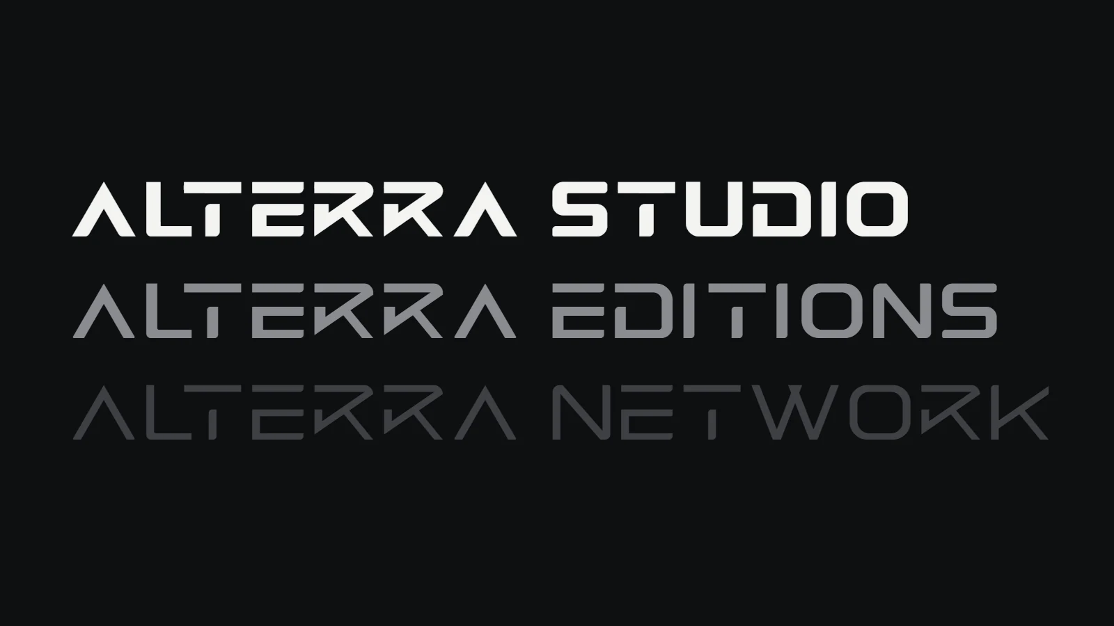
Alterra Secondary has upper and lowercase, normal widths, and the same corners and square terminals. It drops the cut and gives A a crossbar, so it stays readable at 18 pixels.
A display face built from a logo works for short, large words. Copy and interface need lowercase and quieter shapes.
The design system
Black, off-white and one orange, the colours of the logo's own lockups.
- Black #0E0F11The ground for specimens
- Off-white #FAFAF9The film's paper and the site
- Orange #FF3701The cut, and nothing else
Built in code. Every glyph, the spacing, the kerning and the names Windows uses to group the weights come out of one script. Change a rule, rebuild, and every letter that uses it updates.
Weights. Light, Regular and Bold rebuild the logo's letters on the grid at stems of 100, 140 and 182 units; Bold keeps the traced originals.
The film. Drawn in Rive from the fonts' own outlines. The camera only pushes and tracks, and the clicks and bells are synthesised clockwork timed to the picture.
Results
- Family
- Alterra Primary in Light, Regular and Bold; Alterra Secondary in Regular, Medium and Bold
- Match to the logo
- The traced letters cover 98.6% of the logo's pixels; rebuilt from the rules alone at Bold, 96%
- Characters
- Primary sets capitals, figures and basic punctuation; Secondary adds lowercase and symbols such as & @ # % *
- Film
- A 69-second construction film, drawn in Rive from the fonts' outlines
What's next
- Set the site in it Primary for one-to-three-word moments like numbers and the nav lockup, Secondary for headings and interface.
- Accented letters so Secondary can set names and places in other languages.
Questions & answers.
Alterra Primary: the case in 4 short answers.
What did Alterra Primary need?
Our wordmark was a 2,000-pixel image with no vector source, and it had five letters. We wanted headlines, numbers and lockups that look like the logo without anyone redrawing it by hand each time, and a quieter face for everything else.
What did Alterra Studio do for Alterra Primary?
We measured the wordmark row by row. Its cap height splits into five equal bands, stems are 182 units and bars about 140, and every stem that meets a top bar stops one band short. We call that the cut. A, L, T, E and R are traced from the file at four times its size; the rest of the capitals and figures follow the same grid, the cut and R's angles. S, O, U, D and N come from our Studio and Editions lockups. Everything is generated by code, so changing a rule rebuilds every letter that uses it.
What was the result for Alterra Primary?
Alterra Primary comes in Light, Regular and Bold, and Alterra Secondary in Regular, Medium and Bold. Laid over the logo, the traced letters cover 98.6% of its pixels. We drew the construction in Rive as a 69-second film.
How long did it take?
Drawn October 4, 2026; film finished October 5, 2026.
The thinking behind it.
Guides on the decisions behind work like this, written by the team that did it.
All insights- Brand5 min read
How we turned our logo into a type family
We measured the Alterra wordmark, traced its five letters, and grew it into three display weights and a text companion. The grid, the rules and what we'd do differently.
- Brand9 min read
Startup brand identity examples, and why they work
10 startup brand identity examples from Linear, Vercel, Stripe, Figma, PostHog, Perplexity and more: the one specific choice each makes, why it works for its buyer, and how to brief your own.
- Brand8 min read
Is your brand ready for a Series A? A pre-raise checklist
Is your startup brand ready for a Series A? A pre-raise checklist across clarity, credibility, consistency and conversion, with research on first impressions and a timeline.
Want a typeface drawn from your logo?
Book 30 minutes and bring your wordmark. We'll tell you whether it has rules a font can grow from, and what that would take.
Book a call, get a price rangeCurious how your site compares?  Run the same audit on your site →