
Ourroom: a brand for an app that settles the sofa fight before the sofa arrives
Book a call, get a price rangeOurroom is an iPhone app for couples and flatmates: scan your room once, both move the furniture around live with named cursors, see what fits to the centimetre, and buy only what you both said yes to. We built it from scratch: the name, a drawn room where each piece wears the colour of whoever suggested it and turns solid ink when you both agree, the wordmark and app icon, the iOS app, and the launch on posters, a bus shelter, packing tape and a tote.
- Project
- An Alterra Studio project: we built the company's brand, product and launch from scratch
- Stage
- Consumer home app, seed stage
- Services
- Naming, world and key art, wordmark and app icon, the iOS app and its Lock Screen moments, App Store set, posters, out-of-home and merch, animated board
- Tools
- A furniture kit drawn in code, Nano Banana Pro, HyperFrames
Two people, one room
Every funded room planner we audited is built for one person deciding alone. Ourroom is built for two: both move the same sofa in the same room, live, and only what both said yes to gets bought.
Ourroom is an iPhone app for couples and flatmates furnishing a shared place. Scan the room once, drop in the furniture you're eyeing, and both of you move it around, each with a named cursor. It checks what fits to the centimetre, and the pieces you both agreed on go into one basket, split between you.
The brief, in a founder's words: "Couples furnish a flat by arguing over screenshots in a group chat; our homepage has to show two people moving the same sofa in the same room, not one more AI render of a perfect living room."
of people say they hold back their opinion on furniture and decor to avoid a disagreement.
Source: Article and OnePoll, 2018
of UK furniture buyers have bought furniture online that turned out to be the wrong size.
Source: Fixtuur, 2025
have ordered furniture that didn't fit through the door or up the stairs.
Source: Fixtuur, 2025
What we saw on 8 funded room planners' homepages
- One person alone with the tool
- All 8. One cursor, one prompt, one person deciding. None shows two people planning one room, and none names a couple or flatmates on its first screen.
- Speed as the promise
- 6 of 8 say instantly, in minutes or in one tap.
- Pro words on a home tool
- 5 of 8 first screens talk about CAD, renders, clients or staging.
- AI as the pitch
- 5 of 8 put AI in the headline or the line under it.
- A finished render as the hero
- 4 of 8 open on a perfect room. Only 1 shows a real measurement up top.
Four rules every screen follows
- One colour each
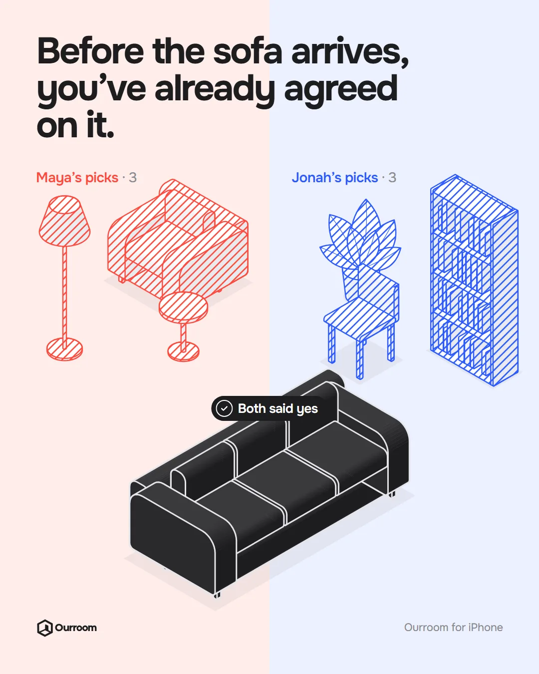
- Maya's cursor and picks are coral, Jonah's are cobalt, so any piece tells you whose idea it is.
- Ink means both said yes
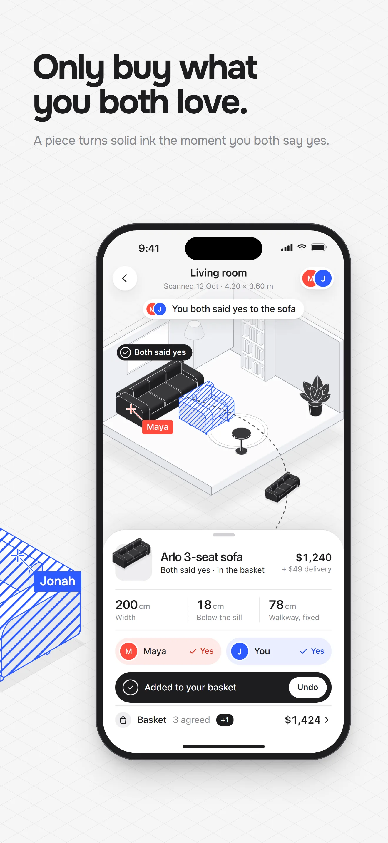
- A piece turns solid ink only when the second person says yes too, and only then can it be bought.
- Every number is a measurement
- The room is scanned once to its real size, so widths, walkways and the wall to spare are in real centimetres.
- Nothing has a colour until someone picks it
- The room and the furniture start white and grey.
What we chose not to build
No AI claim: the scan measures the room once, and the rest is two people deciding. No finished render as the hero, and no CAD or staging words. No speed promise: what Ourroom promises is that you both agree.
A drawn room, measured in centimetres
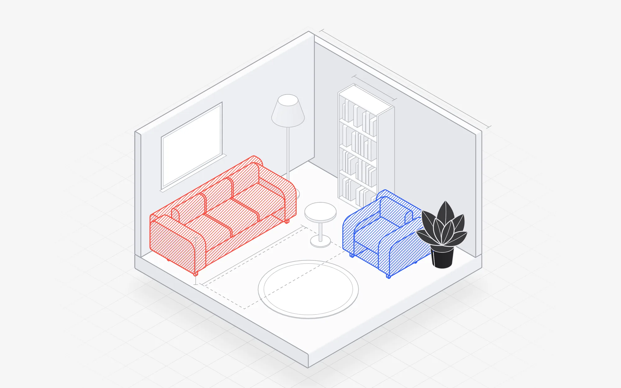
We drew eight worlds in three rounds of generated pictures. Ryan picked Measured: a white isometric room where the piece you pick fills with your colour.
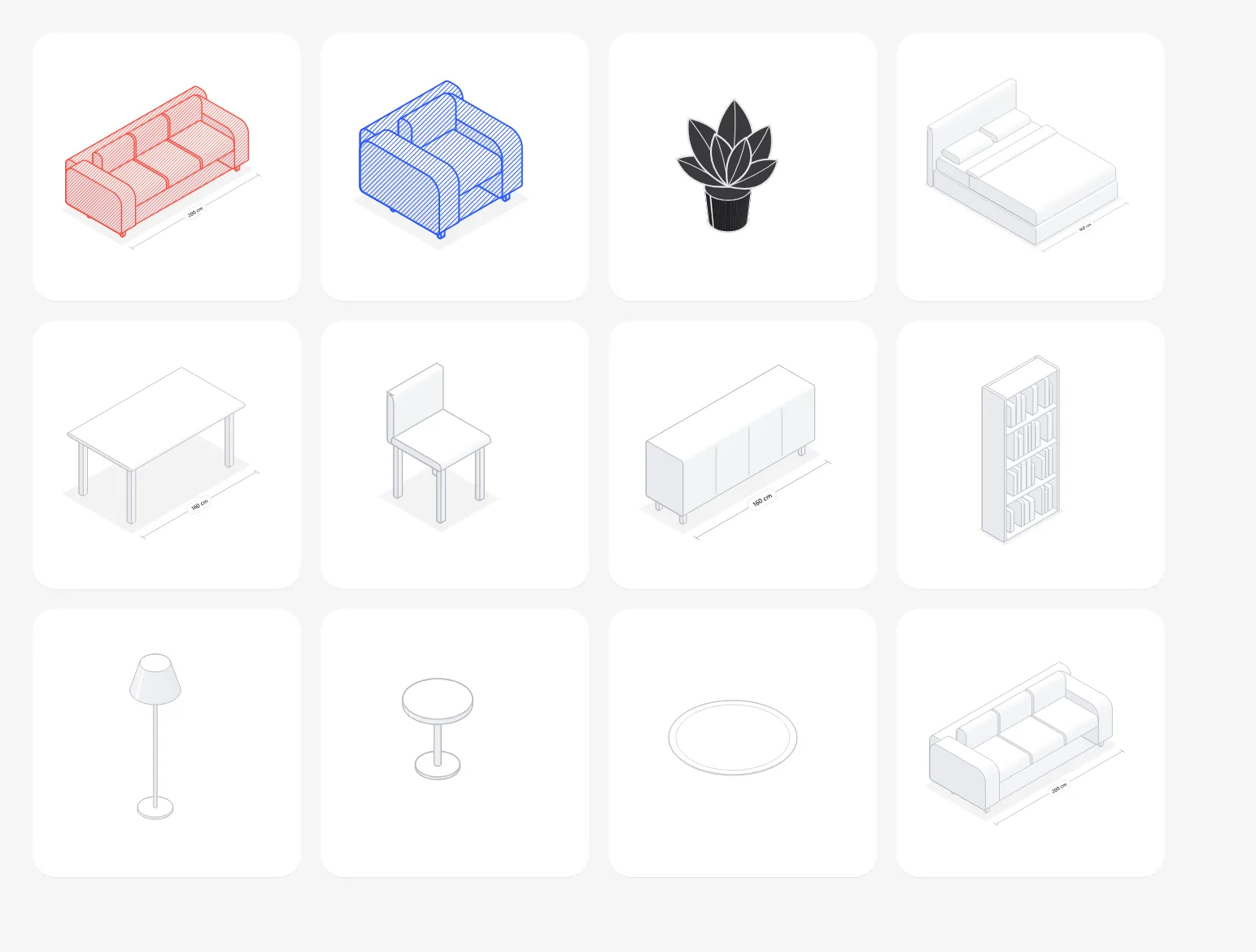
The pictures only set the look. We rebuilt the world as real vectors: a furniture kit drawn in code from centimetres, so the sofa is the same 200 cm in the key art, the app, the posters and the tote.
The kit has 11 pieces, from the sofa and armchair to a lamp, a rug and a fern, each drawn white, coral, cobalt and ink. The key art is the kit's living room: Maya's sofa, Jonah's armchair and the walkway between them.
An empty room in a hexagon
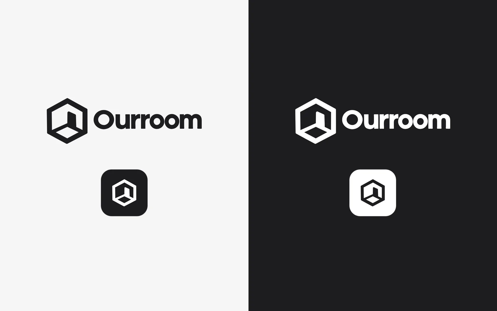
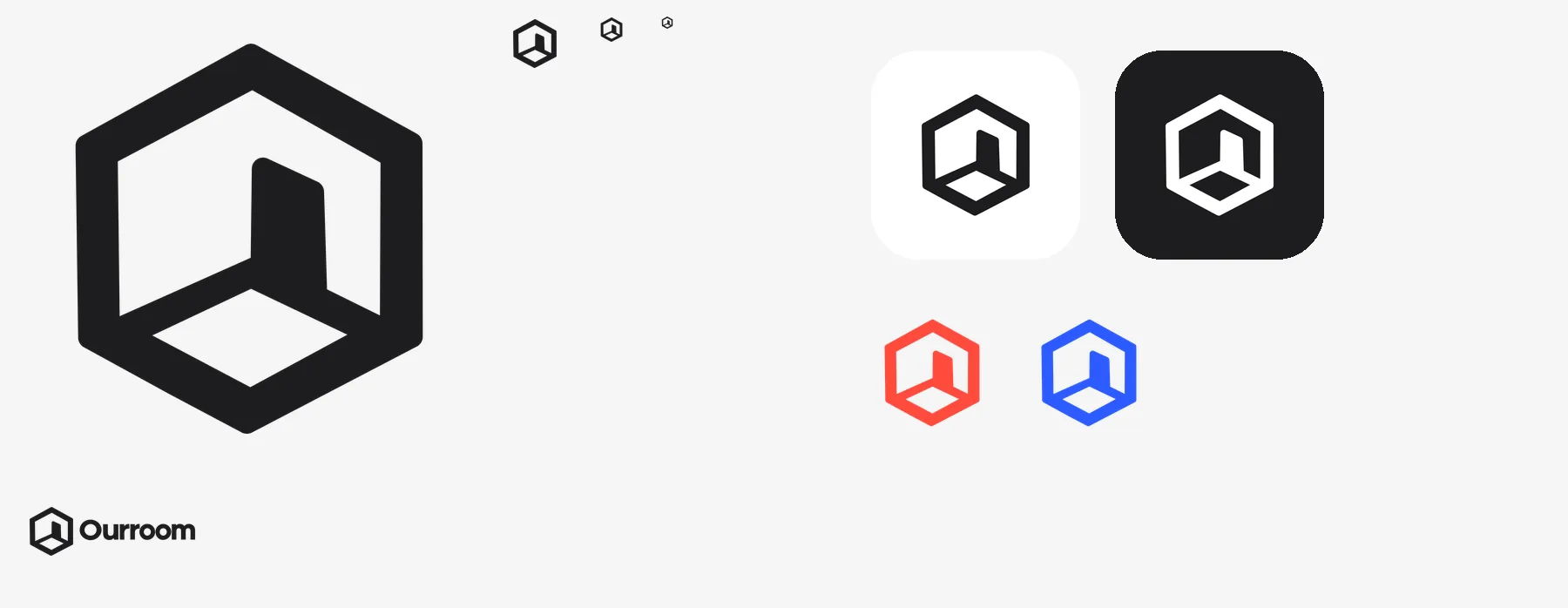
The mark is the corner every plan starts from: two walls meet over a diamond of floor.
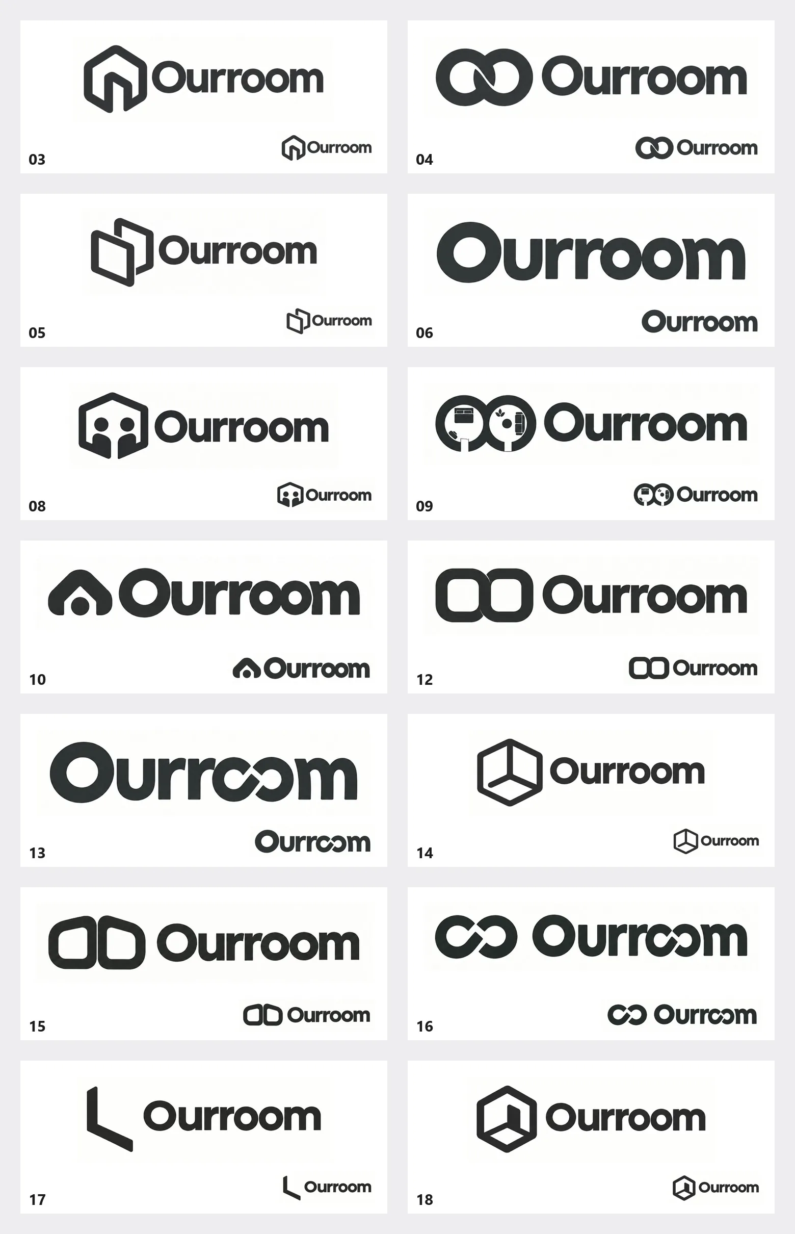
We generated 18 candidates in a chain, each grown from an earlier one, and put 14 on one sheet in the order they were made, at full size and at 64 pixels. Ryan narrowed it to 14 or 18. We kept 18, because it reads as a room, not a package.
We traced it to vector and then straightened it, because the generated edges wobbled at 512 pixels. It still reads at 16 pixels, and in coral or cobalt it can stand for each person. The film builds it from the app's own scan numbers, 4.20 by 3.60 by 2.50 metres.
The identity board, as a 10-second film
The editor carries the board. Every other cell keeps the app's one rule: one colour each, ink when you agree.
Maya's sofa snaps to the wall, the walkway comes up 18 cm short, one nudge fixes it and both say yes. Around it the mark is built, a delivery moves on the Lock Screen, the App Store page scrolls, and the posters, the bus shelter, the tape and the tote take turns. Each swap is a dimension line dragged across the cell by Maya's or Jonah's cursor. It loops without a seam, cut for LinkedIn and X.
The first board scored 7.5 out of 10. We moved the two people to coral and cobalt and made agreement solid ink, and Ryan cleared that version to post.
Three doubts, three screens
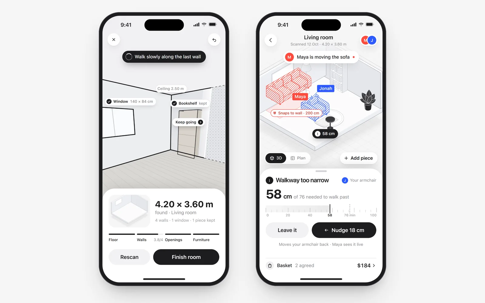
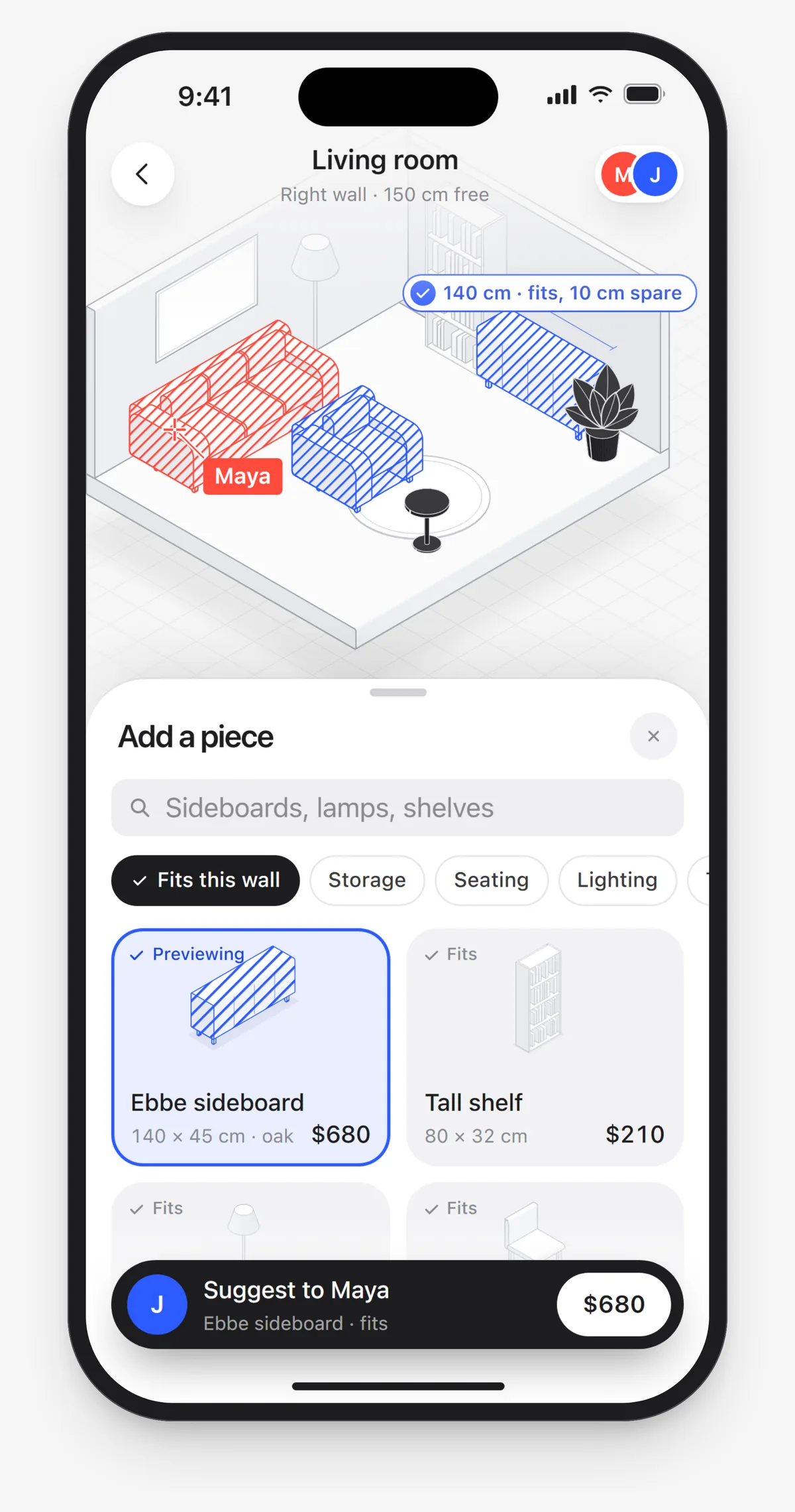
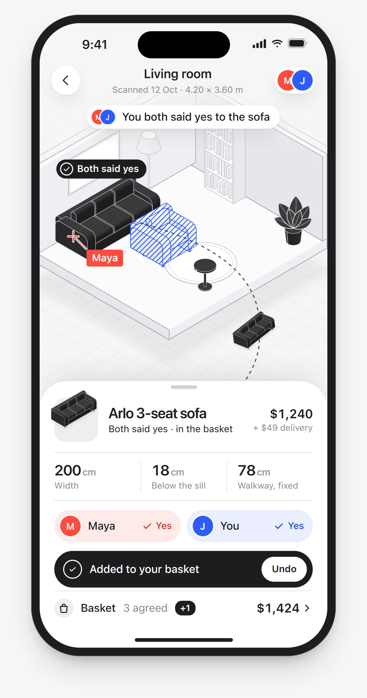
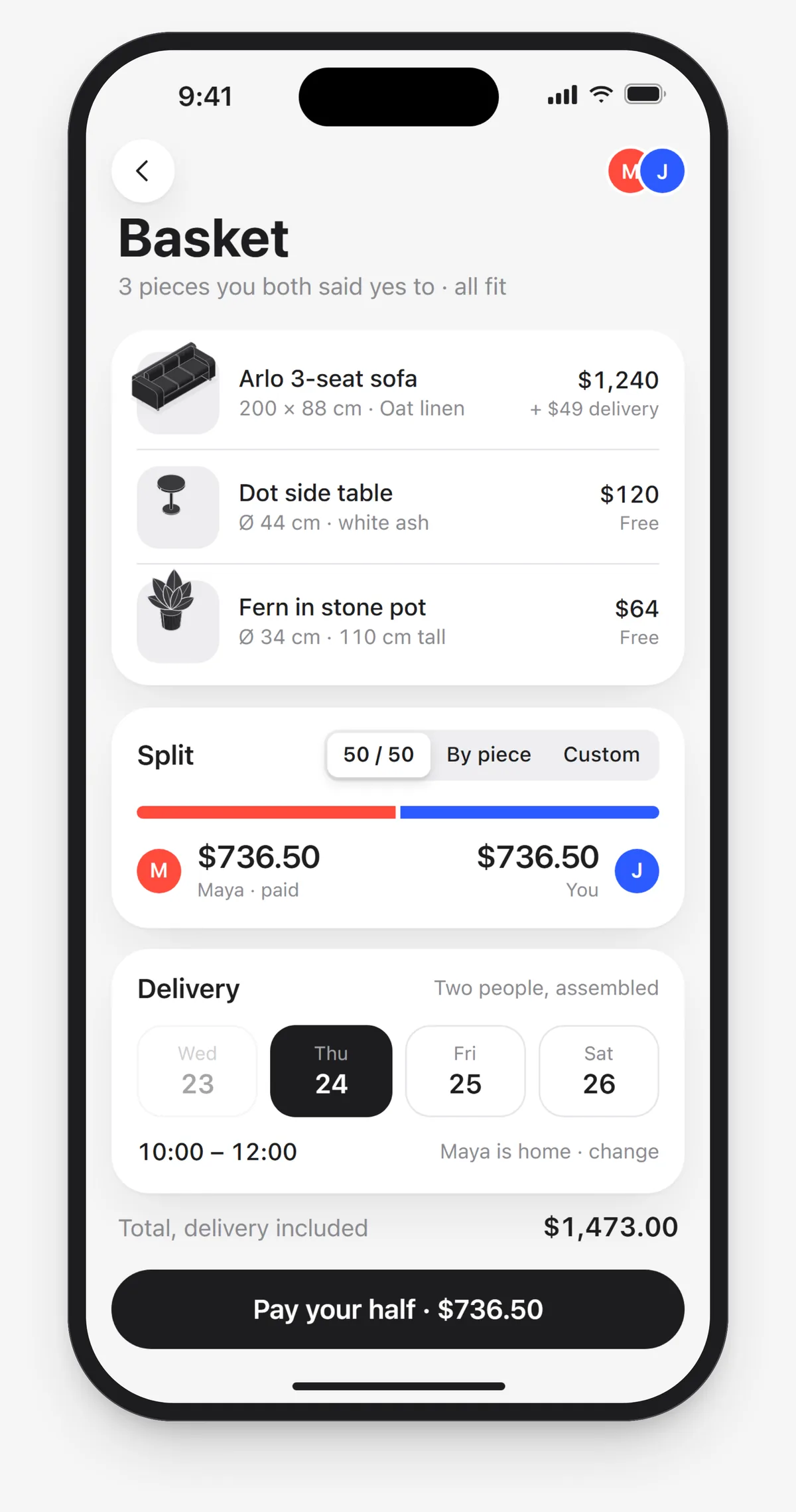
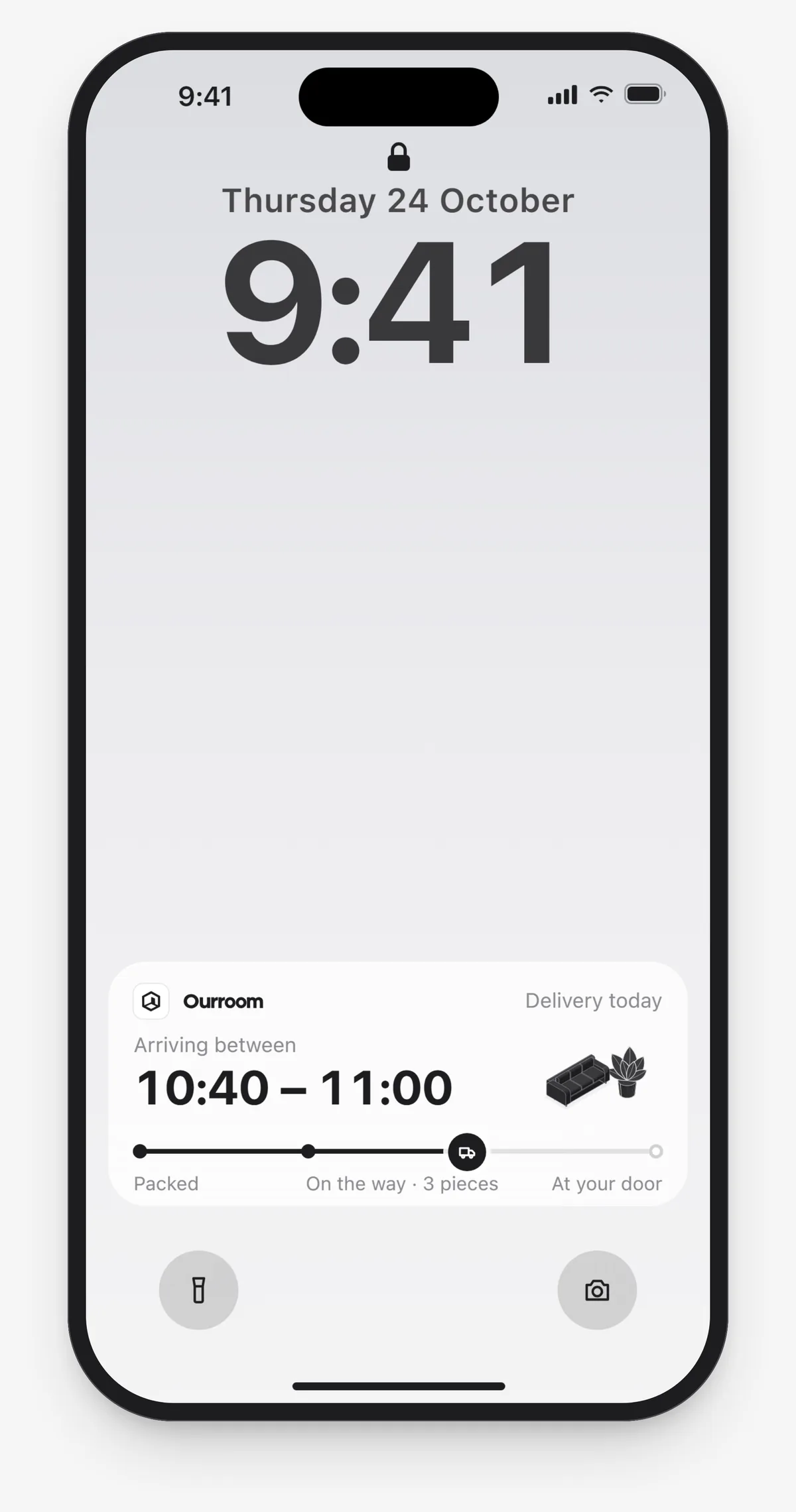
Seven steps, start to finish: scan the room, invite the other person, move the furniture together, add a piece that fits, both say yes, pay your half, and follow the delivery.
Two people bring three doubts to a room planner: the fit, the money and the say. Each is answered on screen, by the product working.
What each person worries about, and the answer
- The one who measures
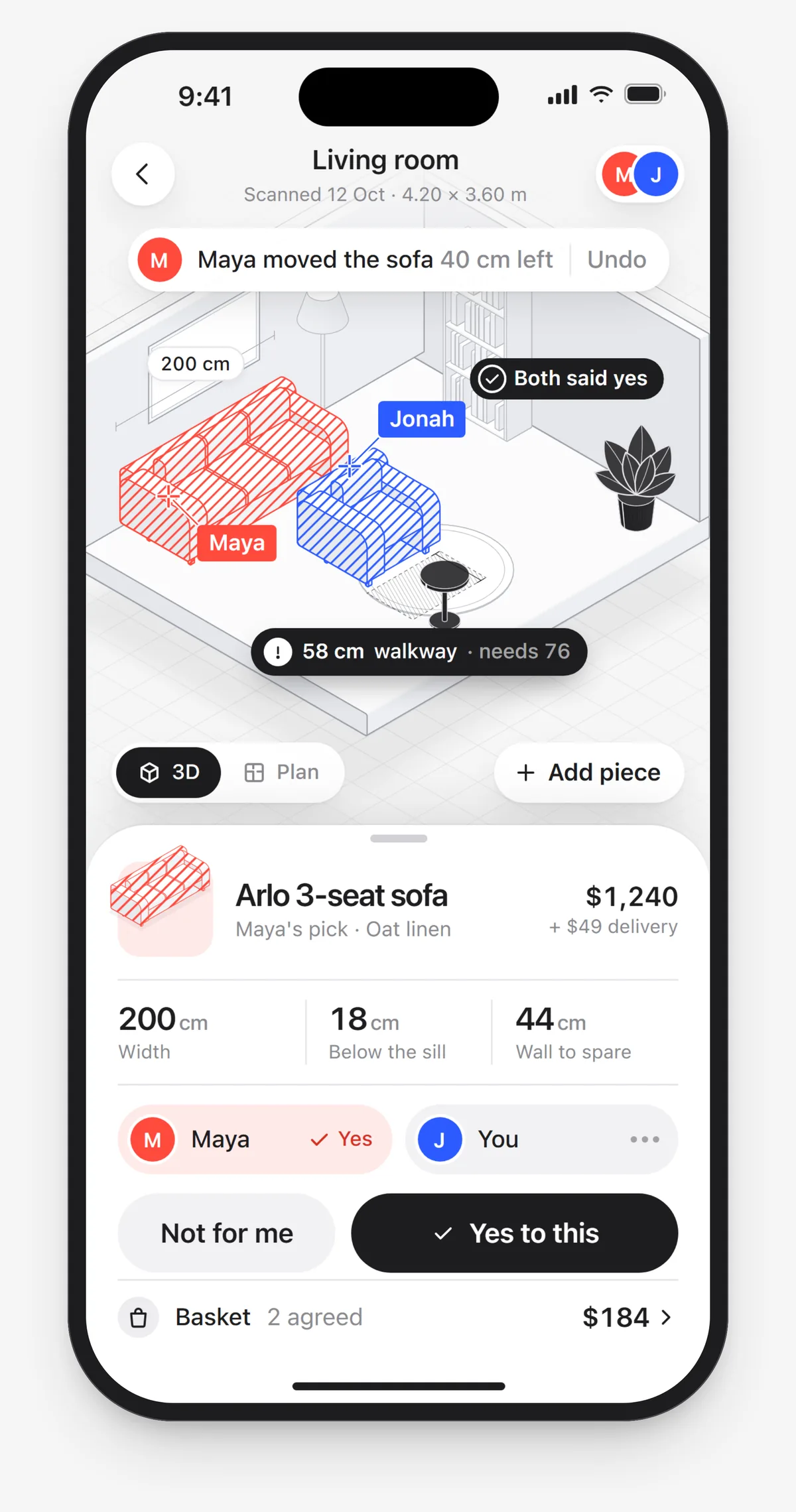
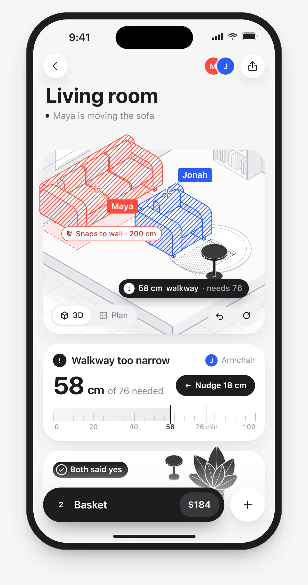
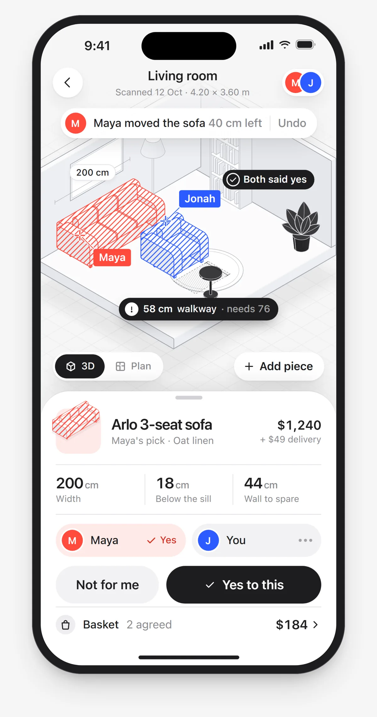
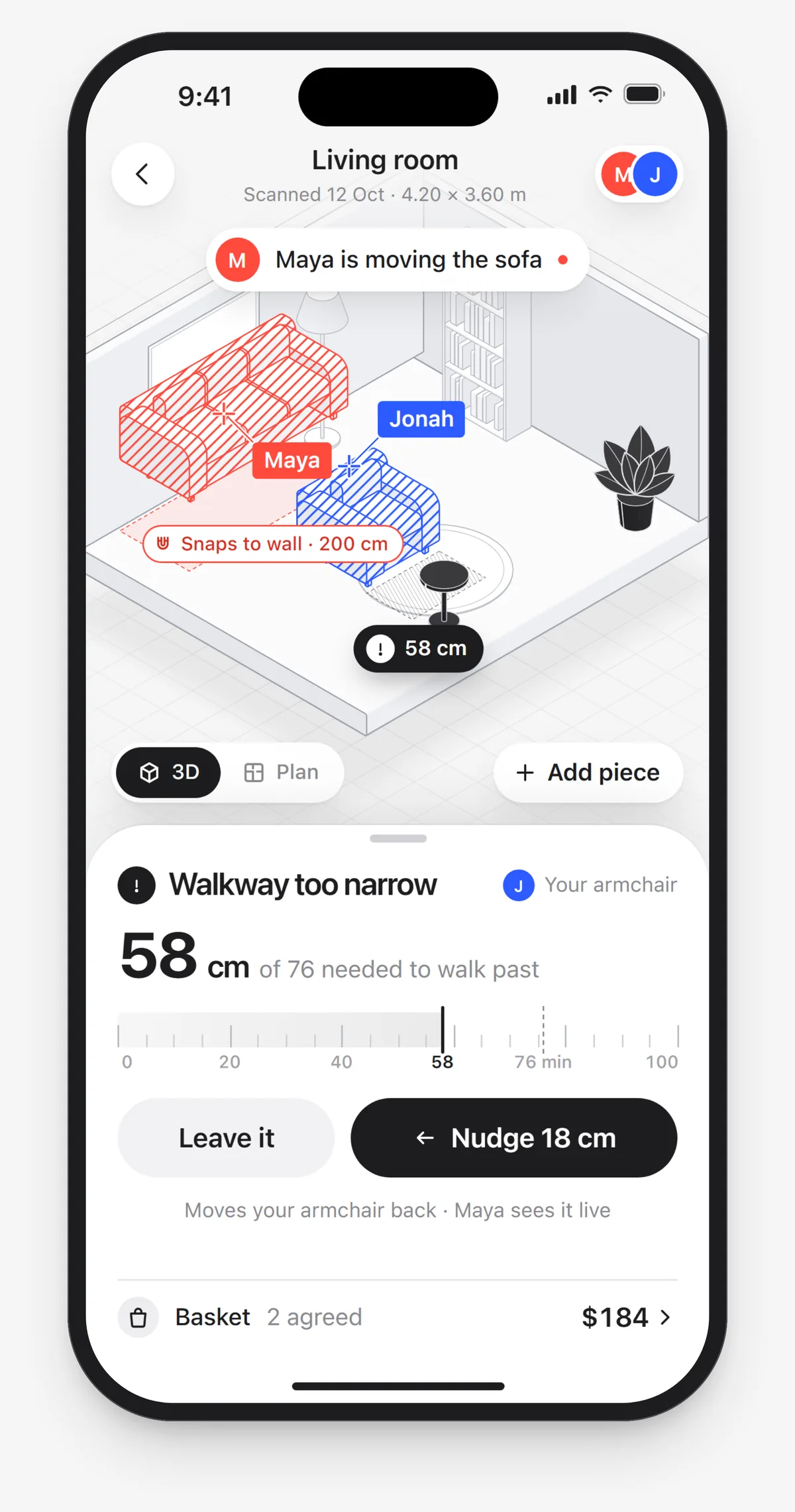
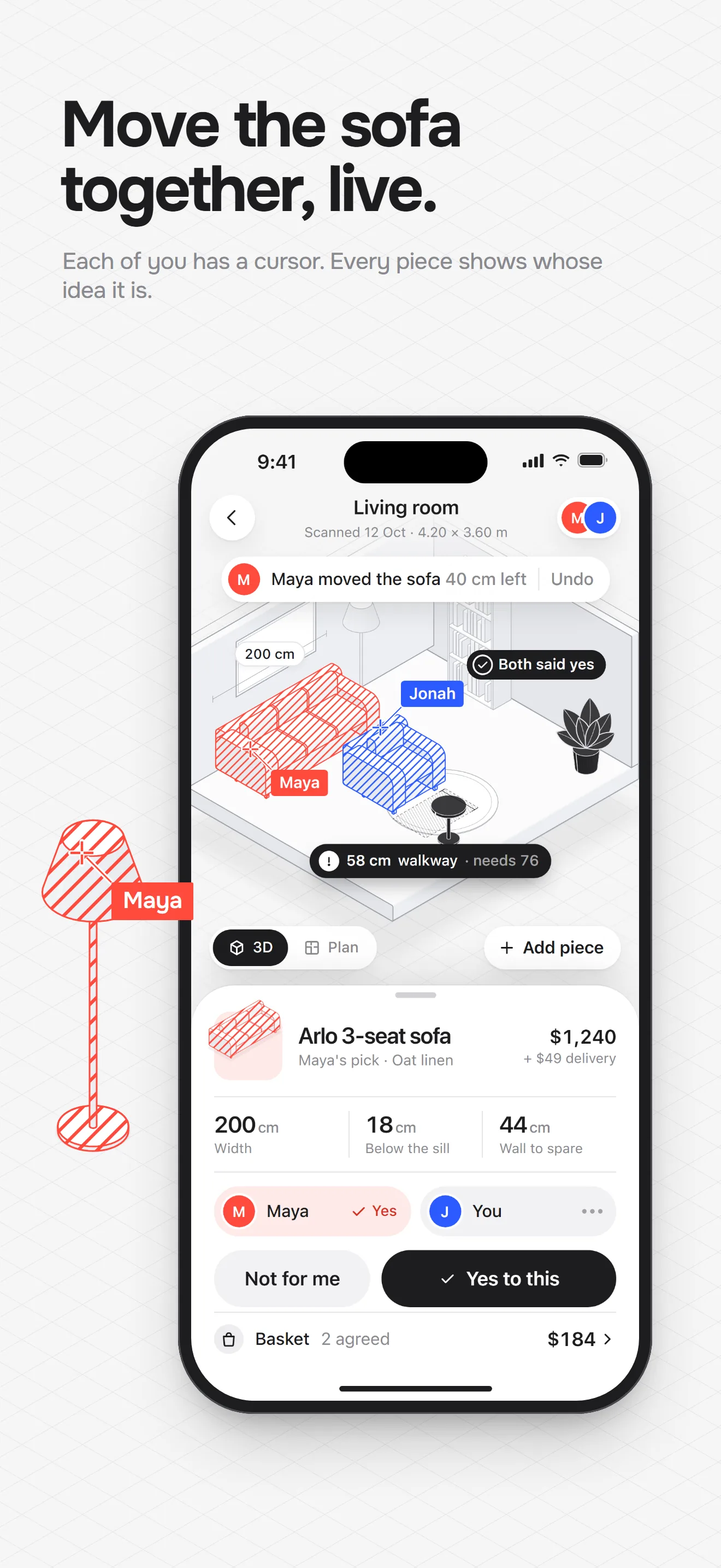
- "An app's guess isn't a tape measure." The room is scanned once to its real size. Drag the sofa and it snaps to the wall with its width shown. If the walkway it leaves is too narrow, the gap is hatched, the sheet says how much is missing, and one button nudges the other piece back by exactly that much.
- The couple
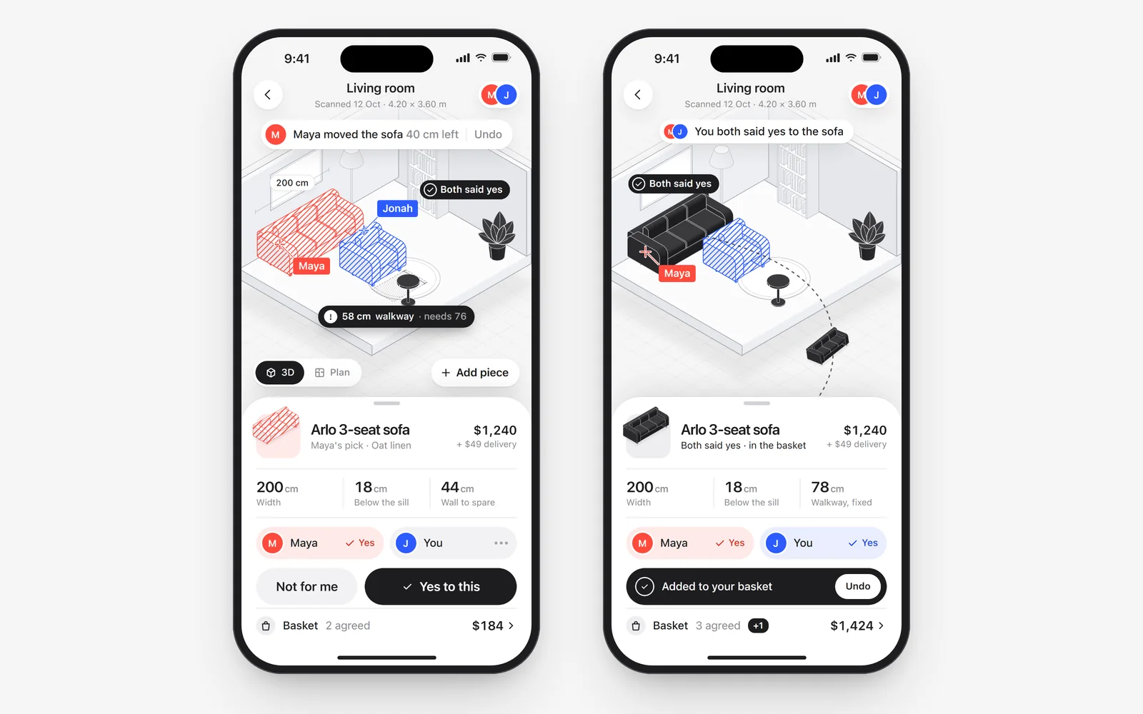
- "One of us will end up choosing everything." Every piece wears the colour of whoever suggested it. It turns ink only when the second person says yes too.
- The flatmate
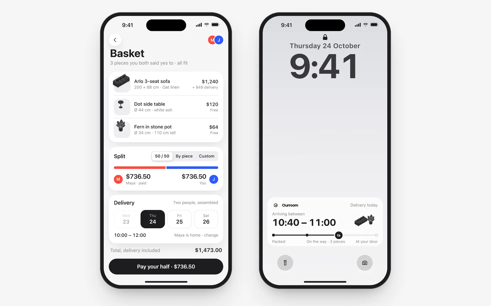
- "I'll end up paying half for something I never agreed to." Only pieces both said yes to reach the basket. The bill splits 50/50, by piece or by a custom share, and each person pays their own half.
Three ways to draw the editor
The editor is the screen that matters most, so we drew it three ways before building the rest.
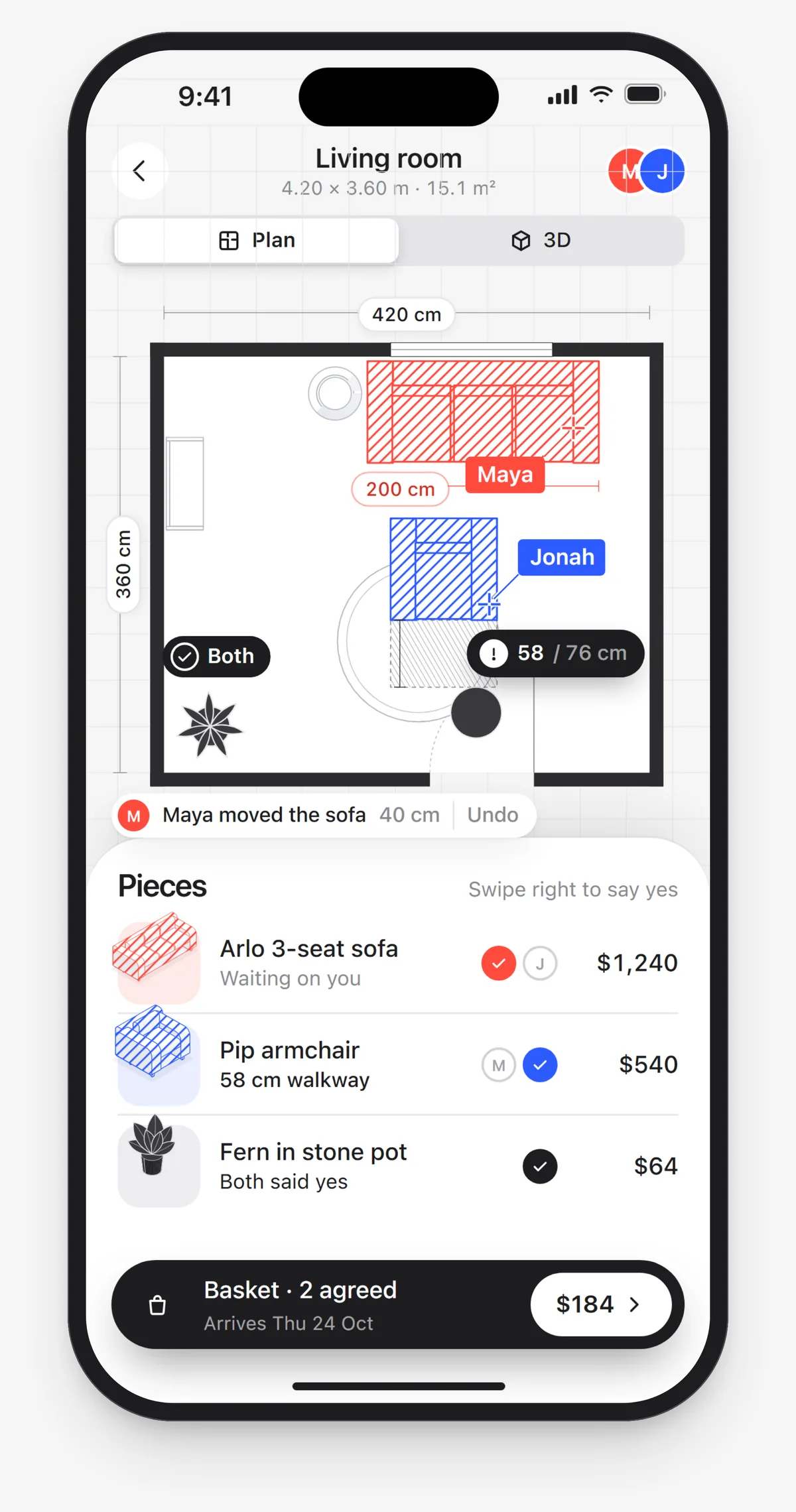
A, Canvas: the room is the screen, and one sheet underneath decides. B, Cards: the room sits in a card, and the piece you lift breaks out of it. C, Plan: a measured top-down drawing, and you vote by swiping the list.
Ryan picked A: the room is the workspace and the decision sits one thumb away. B's lifted sofa and its walkway card moved into A, as the sheet that opens when a gap is too narrow. C was the most practical for measuring, but it lost the drawn room.
One colour each, ink when you agree
White and grey for the room. Coral for Maya, cobalt for Jonah, and solid ink only when both say yes.
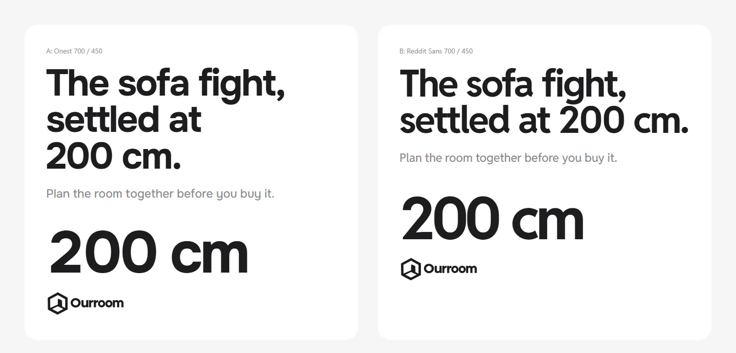
The app is set in SF Pro, as iOS apps ship it. Outside the app, on the posters, the App Store set, the tape and the tote, the type is Onest, set tight and bold, because its round bowls sit with the wordmark's o's.
Every interaction is written down with its spring and its haptic before it's animated, so the board and a real build move the same way.
- Ground #F5F5F5The room, the app's ground, the posters
- Card #FFFFFFSheets, cards and the furniture before anyone picks it
- Coral #FF4A3DMaya: her cursor, her picks, hatched like pencil
- Cobalt #2D5BFFJonah: his cursor, his picks, hatched like pencil
- Ink #1D1D1FBoth said yes: agreed pieces, type, the wordmark
Motion, written down
- Pick a piece
- Long-press 0.25 s. The piece lifts and your colour's hatch sweeps out from your finger, with a medium haptic.
- Snap to the wall
- Within 6 cm of a wall the piece drops onto it with one small overshoot, the "Snaps to wall" chip pops and you feel a rigid tap.
- Too narrow
- Under 76 cm the gap hatches in and the sheet cross-fades to the warning. Nudge moves the other piece by exactly the shortfall while the number counts up to 76.
- Both say yes
- The colour drains to white in 0.12 s and ink fills from the bottom up in 0.22 s. The pill pops, the basket total rolls, and you get a success haptic and two soft taps.
- The other person
- Their cursor glides, so it doesn't jitter, and their name tag trails it by 60 ms. "Maya moved the sofa" drops from the island with an Undo for 3 seconds.
Nine screens, from the scan to the door
Every screen is drawn in code from one tokens file and the same furniture kit, so the room in the app is the room in the key art.
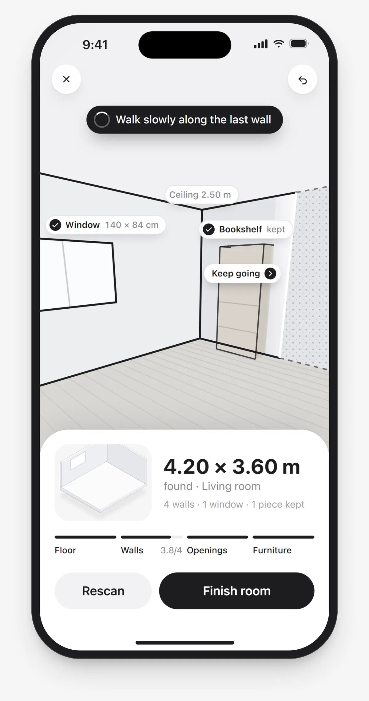
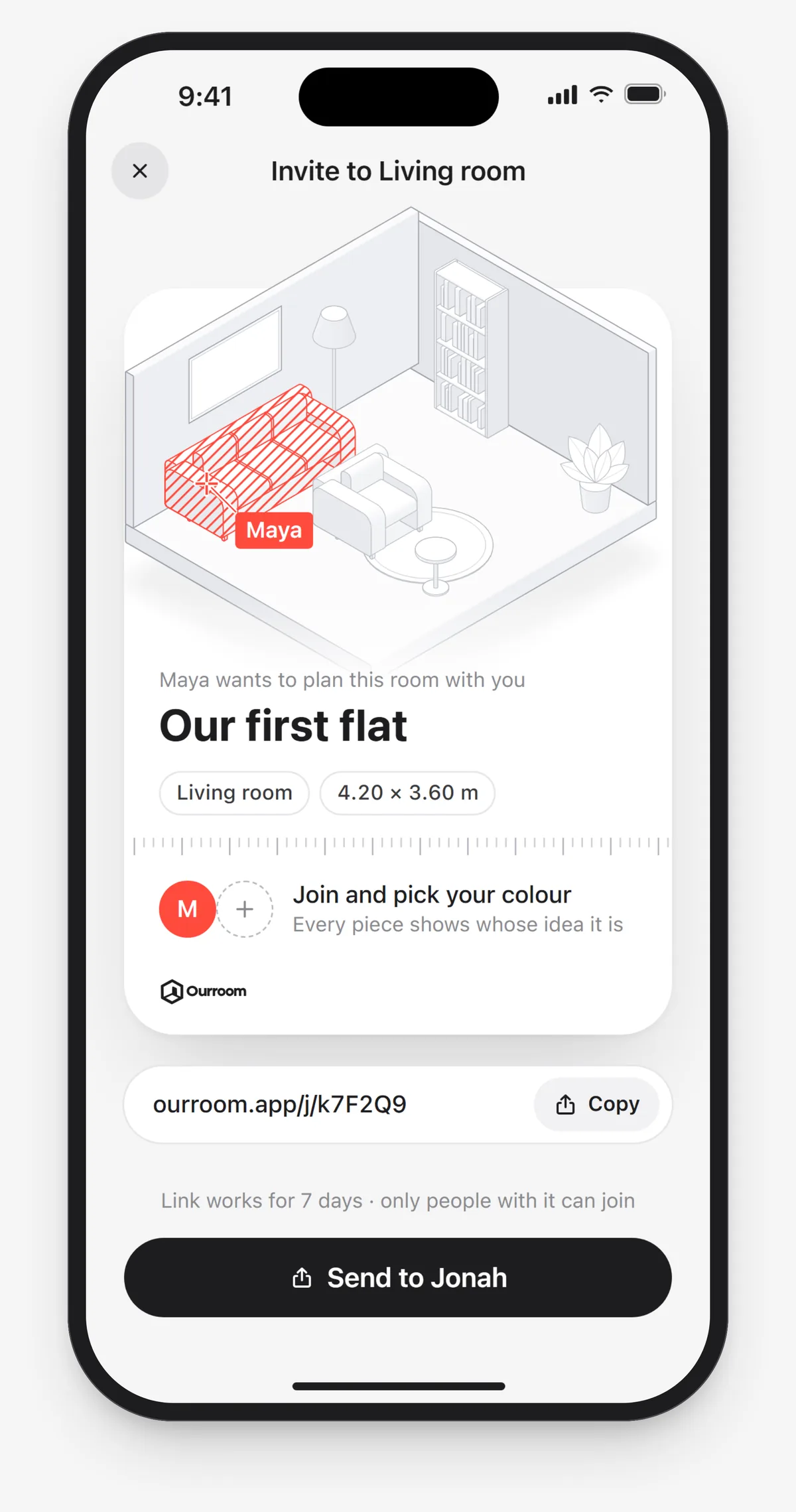
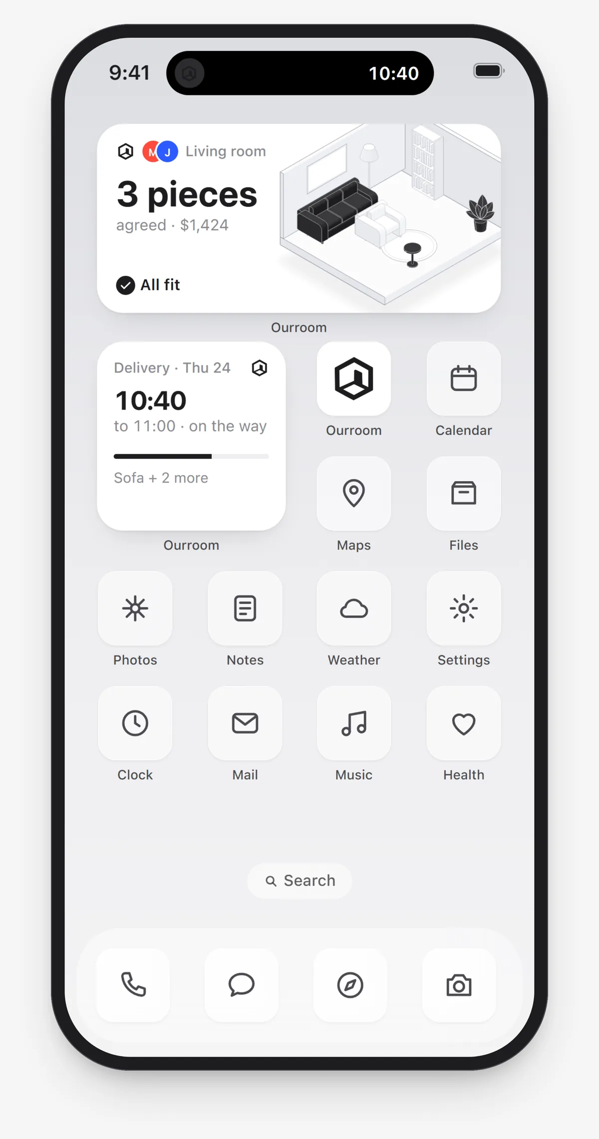
The scan draws the walls as you walk and counts the room up to 4.20 by 3.60 metres. The invite is a link that works for 7 days. In the editor both cursors work at once. Add a piece and the list can filter to what fits the wall you're on. The basket holds what you both agreed on and splits it. Then the delivery lives on the Lock Screen and in a widget until the van arrives.
On the App Store
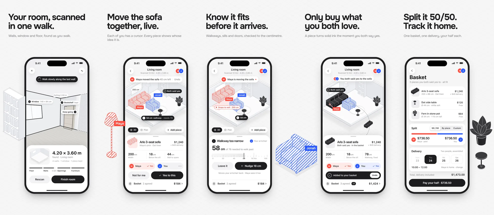
Five frames, one claim each, in the order people scroll.
Your room, scanned in one walk. Move the sofa together, live. Know it fits before it arrives. Only buy what you both love. Split it 50/50, track it home. Each frame holds a real screen, one piece of the kit breaks out of it, and Jonah's armchair crosses the seam between the third and the fourth.
Posters, a bus shelter, tape and a tote
Outside the app the rule holds: the same kit, real centimetres, and ink only for what both people agreed on.
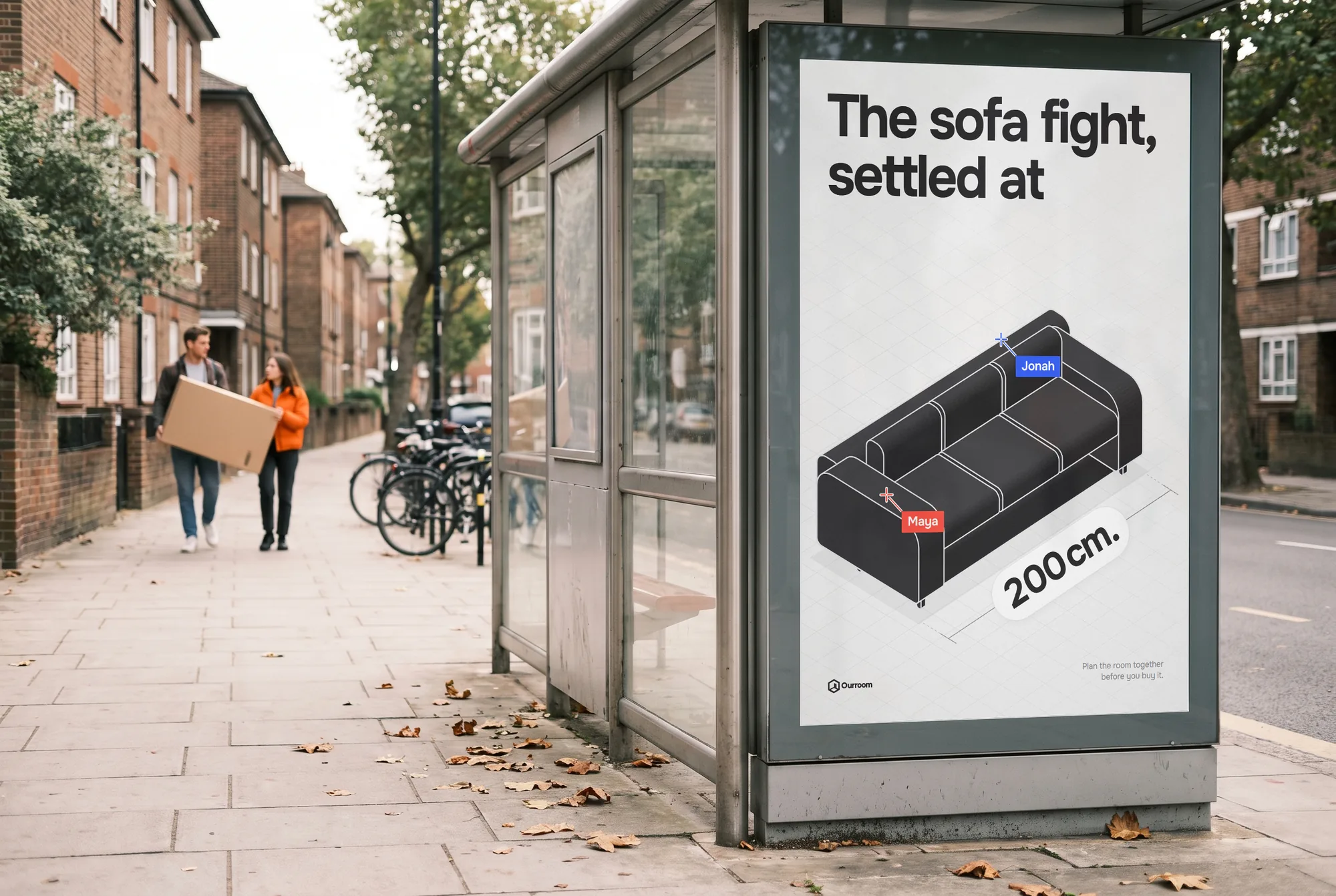
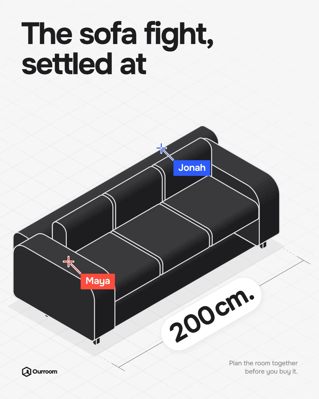
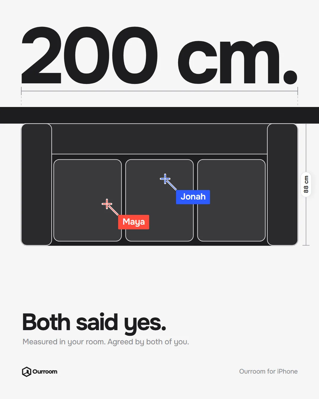
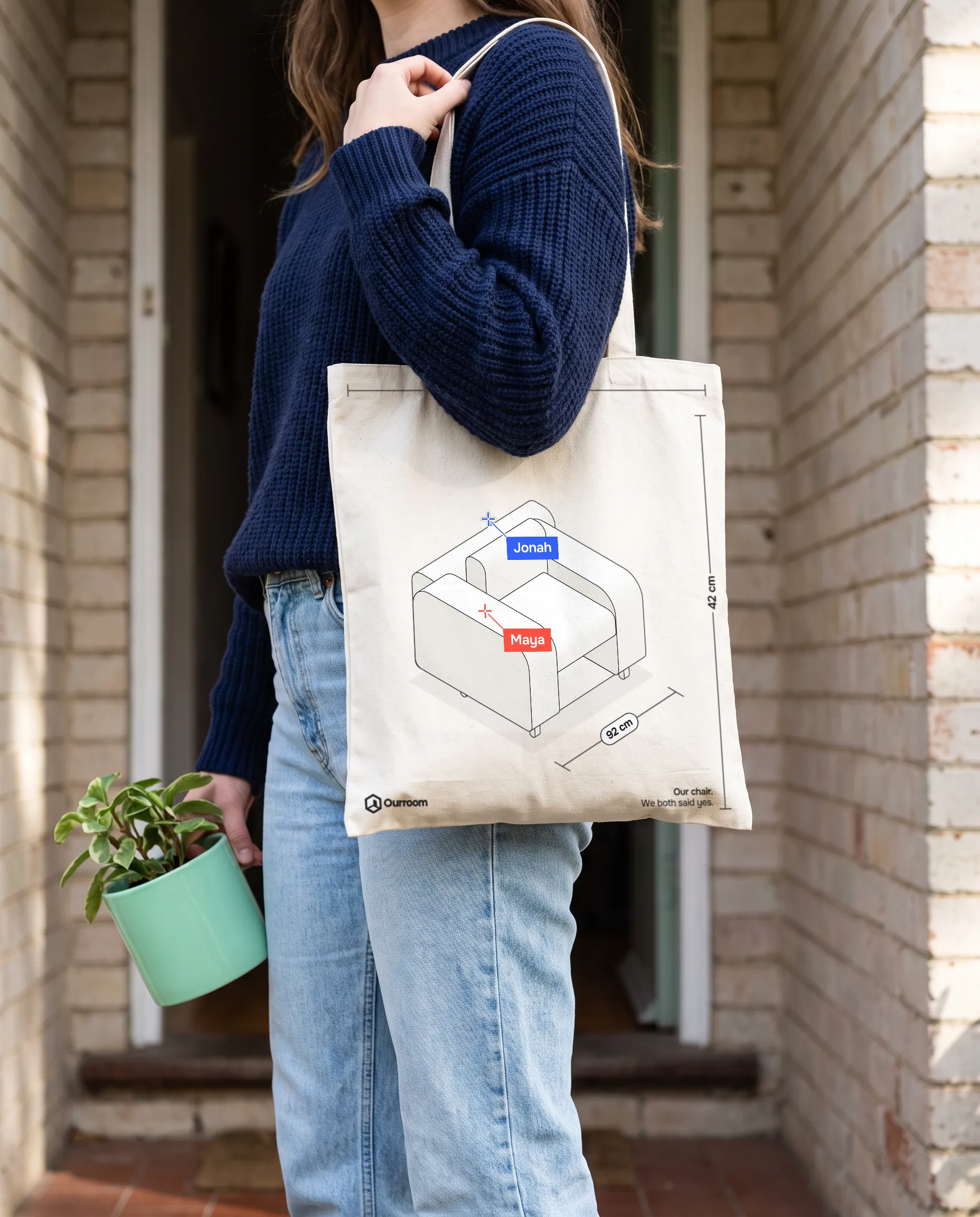
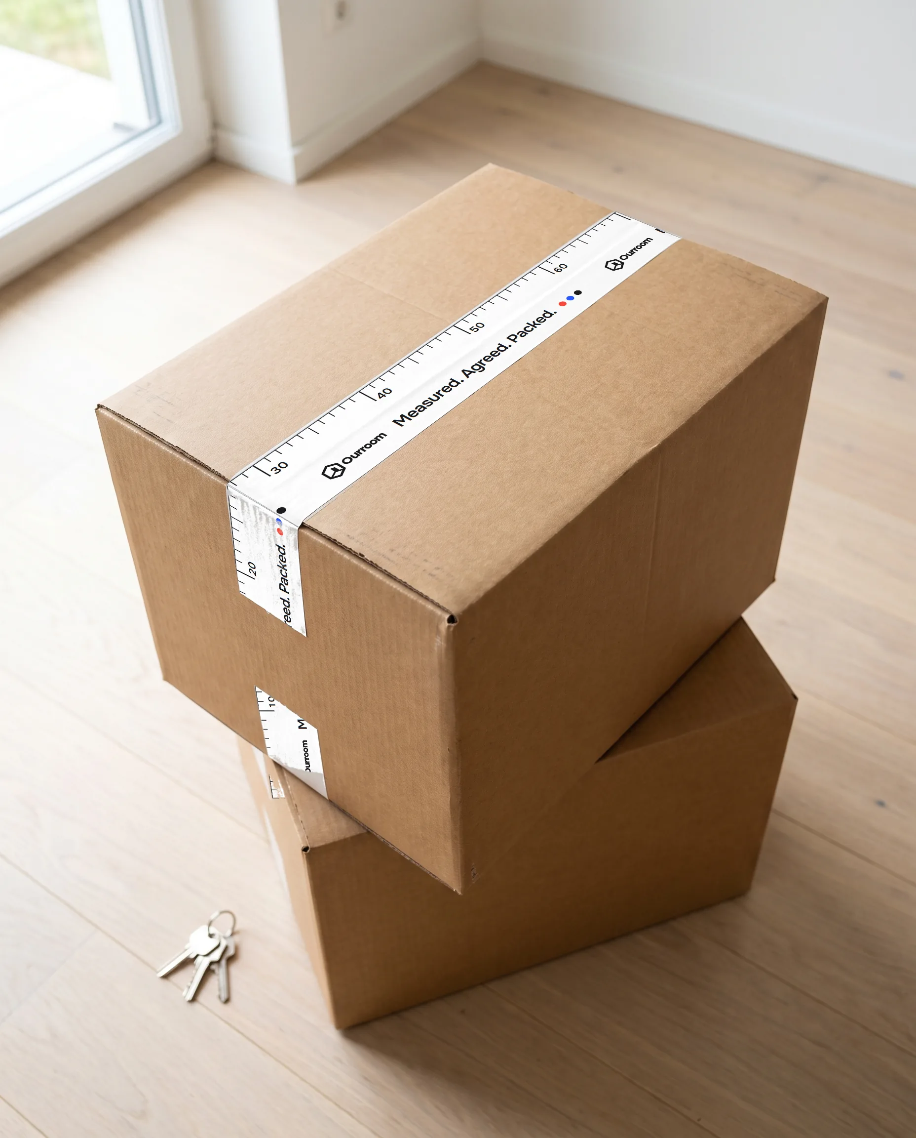
The first poster settles the sofa fight at 200 cm, on the sofa's own dimension line. The third fits its headline so the ink is exactly 200 cm wide at the plan's scale. The packing tape carries a true-scale centimetre ruler. The tote prints the armchair with both cursors and measures itself, 38 by 42 cm.
The posters and the artwork are drawn in code. The shelter, the tote and the boxes are generated photographs, with the artwork laid in to take their light.
Credits and how it was made
Brand, product and launch, made by the Alterra Studio team in one day, 19 October 2026.
Ryan made the key picks: the world, the logo and the editor direction. Generated pictures set the world's look and gave us the logo candidates and three photo plates. The rest is drawn in code: the key art, the furniture, the traced logo, all nine screens, the posters, the tape and tote artwork and the board. So every number on it is real, and it renders at any size.
Who did what
- Strategy and research
- The buyer, the three doubts, and an audit of 8 funded room-planning homepages
- Identity
- Eight worlds in three rounds, the vector key art and furniture kit, 18 logo candidates, the trace of the one we kept, and type
- Product design
- Three directions on the editor, nine screens, the Lock Screen, widget and Dynamic Island, and every interaction written down
- Motion
- The 10-second board and its cells: the editor, the logo, the palette, the Lock Screen and the App Store page
- Launch
- The App Store set, three posters, a bus shelter, packing tape and a tote
- Tools
- Nano Banana Pro and GPT Image (35 credits in all), HyperFrames, and HTML screens rendered with Playwright
The category audit
We scored 8 funded room-planning and home-design apps on our startup homepage benchmark. None shows two people planning one room on its first screen.
Each homepage was scored on 12 criteria, 0 to 2 each, at 1440 and 390 pixels wide. The group averages 14.0 out of 24, level with the 14.1 of our wider benchmark. Half show the product working up top. Only 8 companies met the sample rule, so the audit has 8 rows, not 10.
Every one is a tool for one person, and none names the couple or flatmates furnishing the room on its first screen. 5 of 8 first screens talk to professionals instead, only 1 shows a real measurement up top, and none splits the cost between two people. Ourroom's editor answers all of that on one screen: two cursors, a walkway in centimetres and two yeses.
- Company A19
- Company B16
- Company C16
- Company D16
- Company E14
- Company F13
- Company G10
- Company H8
- Benchmark average, 100 startups14.1
Alterra Studio startup website benchmark 2026. Companies are anonymised.
What we'd ship
For a real consumer home app, this is Brand + Product design.
- Brand
- Name check, world and key art, the hexagon room mark and wordmark, app icon, palette and type, and the one rule for colour: one each, ink when you agree
- Product
- The iOS app's core flow: scan, invite, the shared editor, add a piece, both say yes, the basket and the delivery, with every state, haptic and transition written down
- Launch
- The animated board, the App Store set, three posters, a bus shelter, packing tape, a tote and the X profile
- Next build
- A homepage whose first screen is the shared editor, at desktop and phone width
What's next
- Build the homepage with the shared editor on the first screen, and score it on the same 12-criteria benchmark as the eight we audited.
- Test the editor with five couples furnishing a first flat, timing how long it takes them to agree on one sofa.
The thinking behind it.
Guides on the decisions behind work like this, written by the team that did it.
All insights- Brand5 min read
How we turned our logo into a type family
We measured the Alterra wordmark, traced its five letters, and grew it into three display weights and a text companion. The grid, the rules and what we'd do differently.
- Brand9 min read
Startup brand identity examples, and why they work
10 startup brand identity examples from Linear, Vercel, Stripe, Figma, PostHog, Perplexity and more: the one specific choice each makes, why it works for its buyer, and how to brief your own.
- Brand8 min read
Is your brand ready for a Series A? A pre-raise checklist
Is your startup brand ready for a Series A? A pre-raise checklist across clarity, credibility, consistency and conversion, with research on first impressions and a timeline.
Want this for your company?
Book 30 minutes. We'll tell you what we'd change first in your brand and on your first screen, and what it would cost.
Book a call, get a price rangeCurious how your site compares?  Run the same audit on your site →
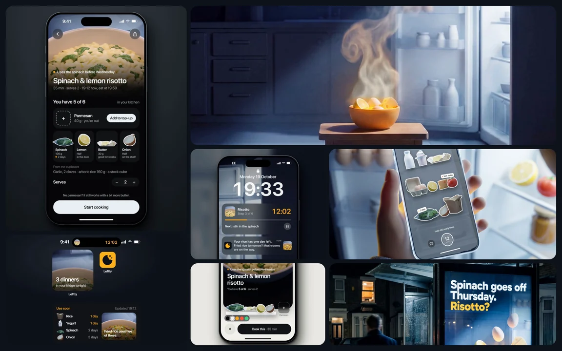
The brand in the feed
A mockup of how the brand would run on X. Not a live account.
Ourroom
@ourroomapp
Plan the room together before you buy it. Scan once, move the furniture live with your partner or flatmate, and buy only what you both said yes to.
ourroom.appJoined October 2026
58 Following3,862 Followers
Pinned
Ourroom @ourroomapp · Oct 19
Meet Ourroom. Plan the room together before you buy it.
2210487041K
Ourroom @ourroomapp · Oct 20
Maya moved the sofa. The walkway's 58 cm. It needs 76. One tap nudges the armchair back 18 cm, and then you both say yes.
125846024K
Ourroom @ourroomapp · Oct 22
The sofa fight, settled at 200 cm. Posters are up.
73330013K